
Focus outlines
Always show where the focus is
Clearly visible focus outlines for buttons, links and form fields – matching your design, without a line of code in your theme.
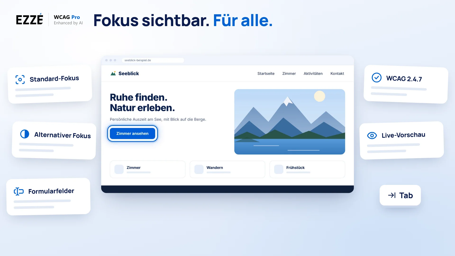
Keyboard users depend on the focus outline. EZZE WCAG Pro gives you three profiles, three methods and a live preview so the focus is just as recognizable on light and dark surfaces. Included in every plan.
- Profiles for standard, alternative and form fields
- Outline, border or box shadow with live preview
- Pure CSS, with :focus-visible by default
Why focus matters
Without visible focus, a website can't be used with a keyboard
People who don't use a mouse jump from element to element with the Tab key. Without a focus outline, they don't know where they are. Focus outlines support three WCAG criteria.
In the video
Focus Outlines explained step by step
From invisible focus to a consistent outline: the video shows the main switch, the three profiles, the style with live preview, exclusions by CSS selector and the result on a sample page. With subtitles and transcript.
Read transcript
You press the Tab key – and no longer know where you are. That's how it is for people who use a website with the keyboard. Here, on Lakeview: navigation, button, footer, form. And nowhere can you see where the focus is. The theme hides it, or every element shows something different. Yet WCAG criterion 2.4.7 requires a visible keyboard focus. With Focus Outlines in EZZE WCAG Pro, you make it consistent. In minutes.
You find the feature in the WordPress menu under EZZE WCAG Pro, in the Site Optimization group, on the Focus Outlines tab. At the top is the master switch: Enable focus outlines. When it's on, your focus styles apply on the public website.
Below that, you choose one of three profiles. The Standard focus is always active and applies to all focusable elements: links, buttons and everything you can reach with the keyboard. The Alternative focus sets a contrast to the standard style, for areas that look different, for example a dark footer on a light page, or the other way round. And form fields get their own style, if you want. The last two you switch on with “Use profile”. And each of these three Focus Outlines, you customize completely: method, line, thickness, color, radius, distance, separately per profile.
Let's start with the Standard focus. For the CSS method, it's best to choose Outline: it's usually the most reliable and doesn't change the size of the element. Then you set line style, thickness and color. For Lakeview, we take a strong blue, three pixels, solid. Corner radius and distance round off the ring. Every change shows up right away in the live preview on the right.
The footer of Lakeview looks different: it's dark. A blue ring is hard to see there. For this, there is the Alternative focus. Activate the profile, choose a light ring and expand the CSS selectors. In the field “Selectors for the alternative style”, there are already example footer links and buttons, the typical candidates. You can add any further selectors: type them in, press comma or Enter, done. These elements are automatically excluded by the standard outline. You don't maintain anything twice.
Sometimes an element shouldn't get a ring at all, for example a decorative slider element or the logo link. For this, there is the field “Excluded selectors”. But how do you find the selector? With the browser. For example, in the Chrome browser, right-click the element and choose “Inspect”. In the “Elements” panel, the matching line is highlighted. Here is an A element, that is, a link, with the class site-logo. The class is written with a dot in front: .site-logo. For an ID, you put a hash in front: #header-logo. You enter this selector in the field. Several are separated with a comma. If the class also appears elsewhere, narrow it down with a section ID: #footer .btn.
Input fields, too, get their own style. Activate the third profile now, the form fields. It applies to input fields, select fields and text areas, that is input, select and textarea. The Send button is deliberately excluded.
Now click “Save settings”. The message appears: Settings saved successfully. Back on Lakeview, the focus ring moves Tab by Tab through navigation, “View rooms”, footer and contact form. Visible everywhere. Consistent everywhere.
With that, the keyboard focus on your website is visible, consistent and exactly where you want it. Check the result yourself, ideally just once: press the Tab key and move through the page. Anyone who gets around with the keyboard will thank you. Focus Outlines in EZZE WCAG Pro: Focus visible. For everyone.
Three profiles
The right outline for every area
A single focus style rarely fits everywhere. That's why focus outlines are split into Standard, Alternative and Form fields. Each element gets exactly one profile, with Alternative and Form fields taking priority.
-
Standard
The focus outline for most elements. After installation it applies to buttons; add links and other elements with extra selectors.
-
Alternative
For areas with a different background, such as a dark footer: white instead of dark blue, for example, or two-colored so the outline stays visible on light and dark surfaces.
-
Form fields
A stronger outline for input, select and textarea. Submit buttons and other exceptions keep the standard focus.
Three methods
Outline, border or box shadow
For each profile you choose the CSS method, line style, a thickness from 1 to 10 pixels, the color with transparency and the corner radius. The settings page hides options that don't fit the method.
Setup
See what visitors see before you save
The settings page guides you through the profiles and keeps advanced options in expandable sections. Built-in help explains how to choose a profile, contrast-resilient styling and a complete keyboard test.
:focus-visible or :focus
The outline appears when it's needed
By default, focus outlines use :focus-visible. Keyboard users always see the outline, while it doesn't distract mouse users when they click.
Check it yourself
How to test your focus
Focus can't be fully assessed automatically. These four steps cover the most common problems.
Tip
For form fields, a stronger outline pays off, for example 3 px instead of 2 px. Other barriers such as missing labels are found by the Accessibility Test.
Good to know
Questions about focus outlines?
Plans, JavaScript, mouse clicks, theme conflicts, layout jumps and the toolbar.
1. Are focus outlines included in the Free plan?
Yes. Focus outlines are part of the website optimizations and are included in every plan, including the Free plan – with all three profiles.
2. Do focus outlines need JavaScript?
No. The focus outlines are implemented in CSS and work even when JavaScript is disabled.
3. Why don't I see the outline when I click with the mouse?
By default the plugin uses :focus-visible. Browsers then show the outline during keyboard navigation but not on every mouse click. If you want it on clicks too, turn on “Apply on :focus”.
4. My theme overrides the focus outline. What helps?
Use the box-shadow method, which is overridden less often, or turn on the option that enforces the border radius. Also check that the affected elements are covered by the selectors of the right profile.
5. The layout jumps on focus. Why?
Usually because of the border method, since the border takes up space, or because of linked images. Switch to the outline method, which doesn't affect the layout, and keep the image link fix turned on.
6. How is this different from the toolbar's focus tool?
As an administrator, you set focus outlines for all visitors. The Focus tool in the Accessibility Toolbar is a personal preference for individual visitors, for example a particularly high-contrast focus ring. The two complement each other.
Get started
Ready for focus everyone can see?
Install EZZE WCAG Pro for free, pick your profile and check the outline right away in the live preview.
Focus outlines for WordPress – visible keyboard focus under WCAG
The focus outline shows which element is currently selected via the keyboard. Many WordPress themes hide it because it gets in the way when clicking – and make the site barely usable for keyboard users. Focus outlines in EZZE WCAG Pro bring it back: with dedicated profiles for standard elements, dark areas and form fields, and with :focus-visible so it only appears when it's needed.
You choose between outline, border and box shadow, set color, thickness and rounding, and see the result immediately in the live preview on a light and dark background. This supports WCAG criteria 2.4.7 Focus Visible, 1.4.11 Non-text Contrast and 2.4.11 Focus Not Obscured – without JavaScript and without changing your theme.
Part of the website optimizations, in every plan
Focus outlines are part of the website optimizations and included in the Free plan. Together with skip links and keyboard shortcuts, they help make a website fully usable with a keyboard. Whatever is still missing is shown by the Accessibility Test.